New Title Card for InForm: Podcast
After recording, mixing, and editing the InForm: Podcast interview with Todd McGowan I uploaded it to my Transistor.fm account so I could release it, and when I looked at the InForm Title card I thought...
"That's not very good."
When I made it I wanted something simple, and readable. But now I'm just board by it. So, I started to go to work on making something more interesting. The images below show the progression, and what I ended with.
First Draft:
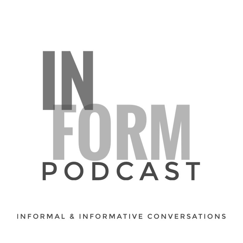
The first thing I did was use a blank white background, and then I opened that in snapseed, and started to add text. I wanted three things.
- The words In Form
- The signifier Podcast
- And the tagline "Informal & Informative"
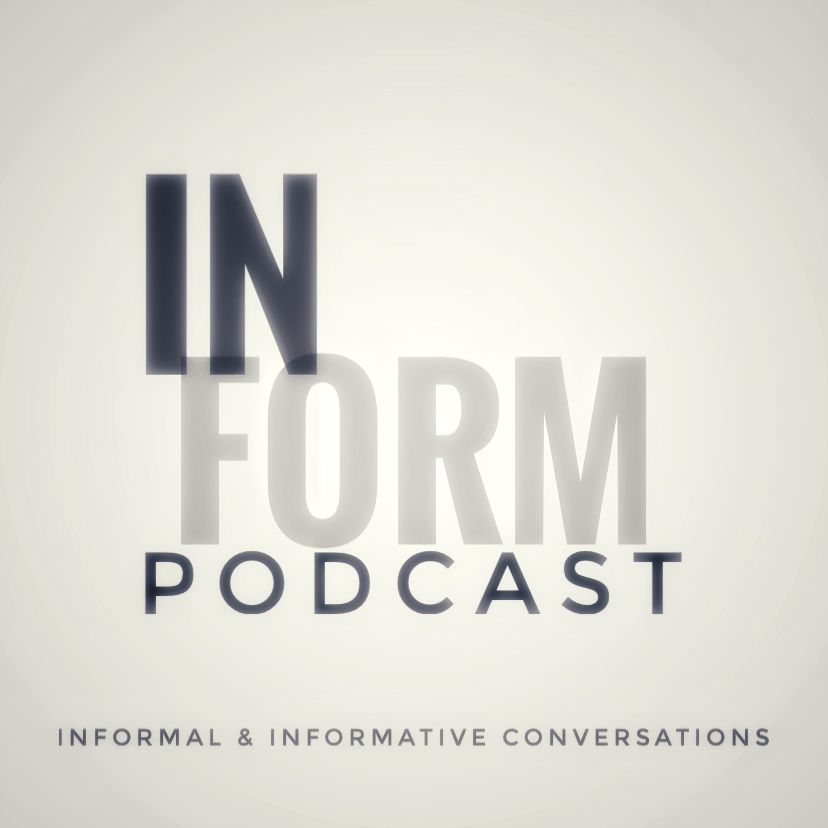
Second Draft:
Next I started to add filters. This gave the image a softness, and that softness gave the totally image a very different feel.
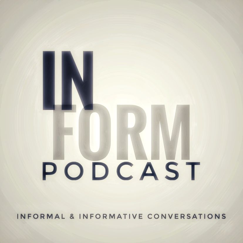
Third Draft:
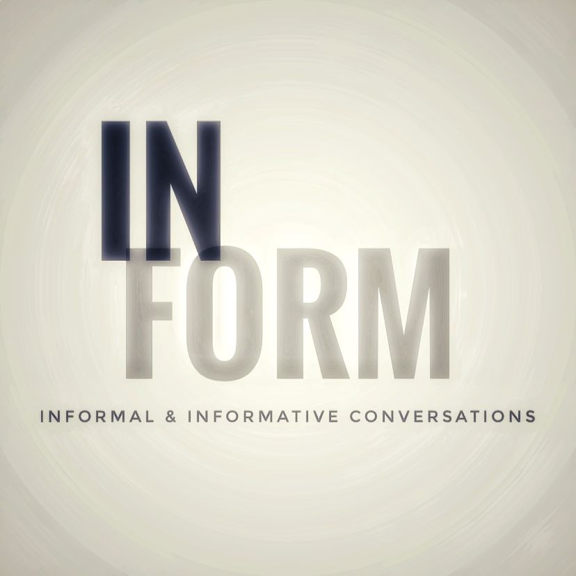
Next I messed with the filters some more, sort of turned up the effect from the second draft. The biggest effect was to the background. Now there was this sort of paintbrush looking circle. I liked that. (I was also a little worried I might be overdoing the effects... I'm still a little worried about that. Be that as it may, I kept going.)
Final Draft:
In this last image I removed the word PODCAST, because people who are listening to In Form: Podcast know it is a podcast. I thought this sort of de-cluttered the overall image.
At the end of the drafting process this is what I had.

I still think the second draft above might have ben good enough, perhaps even better than were I landed. But, for now, this is the In Form title card.